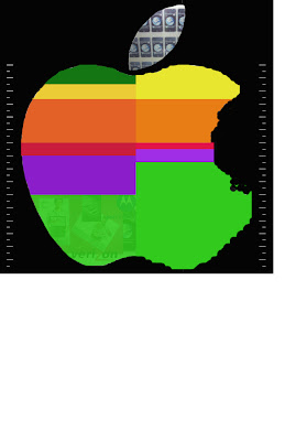

So, after reading Friday's comments I kind of revamped my diagram. I had started building a 3d model to which I was going to apply graphics to but didn't have a developed way to show the time relationship without limiting myself. I have since changed the diagram in which the bars demonstrated are indicating the time relationship in comparison with each step. I am showing 2 diagrams right now as it is not complete but I wanted to get some feedback. The first is the graphic diagram without the color. When I was completing the graphic portion of it I realized that at first glance the start and stop and overlapping of the steps was not 100% clear. I went online to research the logo further and came across the old logo with the 6 color bands so I decided to try to use those to further depict the start and stop of the steps. Please let me know if you have any questions. The colors will be overlayed on the graphic apple and will be less opaque so that one can see the graphics behind the colors. Similar to the bottom left corner of the color apple but even less opaque. Oh, by the way the colorbands obviously aren't finished being touched up. I was wondering if you all think I need to actually put a label over the steps on the diagram. I am hoping not to and hope that the images depict enough compared to my written directions on my last post.

3 comments:
Amr,
Thanks for your email. I am posting it on here so I can receive additional input.
Jaclyn,
I just saw your most recent post of the apple!
Its interesting and hard work done. I thought I should just tell you this:
Your first post was interesting, covering the facts, steps. and the diagram was direct and scientific except for the motherboard!!
Now:
I think your map should be deeper than an Apple!!!!!
The little bites in the colored apple could represent more like a map geography in the left hand side ?? . (just thought) may be it doesn't have to be a exactly an apple!! may be also if the components inside the apple smaller in scale it gives it more breath, and that would give the space for your description in the old post after you develop it.
The colored apple is great showing the different steps with different share in process and time! . but the question now does it has to be an apple?????
I don't think so, I think it should be much more deeper thought .
The white time line in both right and left would be of great function, if used interacting with the internal data in the graphics.
I may be right and may be wrong. this is only my thoughts.
Looking forward to see your best
Amr
Jaclyn,
This is a good response to criticism. Your initial pass was a bit direct and literal. This greatly expands that and re-directs your energy. I think it is the right general direction. The mix of images with an embedded timeline begin to talk about these events happening over a period, perhaps simultaneously. The images are representaions of the actual events, and clearly bring one in touch with a set of events presented in your time line.
The colors are less convincing for me. I admire their connections to apples history. It might be interesting to use them more tongue in cheek - more to say we know apple used to be a computer company, now they are a product company. Tall order, I know and I am not sure how you do it.
The image of apple - I agree that you should looose the specific image, but I am VERY interested in implication of this image. Why is it a bitten apple? Who bit teh apple? Can your "map" or diagram begin to unravel this icon, and still identify the "other"?
Jaclyn,
Good stuff! I am very interested as well to see your final product. Obviously, what is more intriguing for mi is the same king of questions that Ted was asking (who, when, why….) It is very difficult to me to see your work in progress and give (if not an accurate assessment) a good feedback, but…. even tough I can see where are you going with all this I will like to know better is: why are you doing it so? Why that colors, why that graphic, way did you change an “architectural” looking diagram to a “graphic design” one. I ask you this because is in my own process that I am asking this,….. why do we architects try hard to be originals? (You know what I mean?)
I think the collage of images an ideas is great as a way to represent the process that happens when we are “buying” a product form the apple store, but it remains in me the idea if anyone that is not “familiar’ with the exercise we are doing will get the “idea” of mapping this process…..(I know you are not finish – work in progress- and its because of that that I mention it…. If you had anticipated this before, good, if you had not god!). as well I wanted to ask if you are going to go with the “collage” / chaos feeling with it or if you are still to work in some progression of events (mapping?
The one that I had a problems visualizing is the color graphic. (maybe in part for the same reason I asked you about the chaos feeling in the images of the first graphics. I am not sure how to interpreter both of them together. That is way I ask!)
And something I can not but avoid is to “think with the pen on hand” so I am attaching to my “secondary blog some ideas that I was generating while I was reading your blog. Not to suggest direction what so ever, but to create a detonating effect (that might complement, confirm your present design or simply not be relevant. (http://bac-gus-sidenotes.blogspot.com/2007/08/jaclyn-01.html
Gus
Post a Comment