
Wednesday, August 15, 2007
Next Step
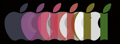
I wanted to go ahead and get this posted so that I can get some feedback from it. I know that people said to stay away from the icon but I really wanted to use it in some fashion especially being from NY (the apple). So I read Ted's remarks over and over and thought to myself, how do I go on from here? Do I start over, did I do anything right? So this is what I have come up with. I looked into the apple logo/slogan some more. The slogan that went along with the original logo was "Byte into Apple." We all know that bytes are a form of measurement for the computer world. Sooo.... I semi kept the icon. I am starting with the whole apple (with no bite in it) and will include the graphics that were on my last diagram for each step. However the steps are now represented by bites (bytes) that are different sizes. As bites are continuously taken each step is performed and less apple remains. Eventually, over time, the computer "apple" logo turns into the "i" that currently represents all of the Apple products they have on today's market. I know the individual graphics aren't on here but I wanted to get some feedback from you all.
Subscribe to:
Post Comments (Atom)
4 comments:
Jaclyn,
I think the work has progressed graphically from your original sketch. I am pleased that the linear process is crossing borders with the history of the apple icon. I worry a bit about literal readings of the apple and how it transfers to the i. The process of mapping is getting lost in the process of trying to establish an icon or specific identiy.
The previous study seemed to map the process in a way that integrated visual steps, time, identity, and related items. The mother board still bugs me abit, but I can get past that given the complexity of the overall image. Again though, apple is one source of origination for the purchase. I think it should have a less significant presence in the overall image. The steps, portals,virtual landmarks might play a larger role in advising a fellow traveler.
Ted
Jaclyn,
I thought I should visit your blog before I signed out to see if you had posted anything new. I was trying to interpret your first image, however I got stock past a few points. I did like very much the idea of the consumer on one side vs. the producer. I think your new image is stronger! I like the metamorphosis or evolution of the apple into "i". As mentioned to Gus on his last post, I just started reading a book about new approaches to design. Creating the fourth dimension, empowering the consumer. Perhaps the apple has evolved from a two dimensional computer product to a three dimensional object. In this case the "i" is really the apple seen from above.
Jaclyn
I think that what you just did of starting with the apple before or without the bite is a very good move! as you start from the origins of the IDEA.
I consider The apple with the bite "Logo" an ART WORK.
and I believe that we shouldn't touch art works. I didn't know you are planning to start over with the apple as an origin of the Idea which could be so strong.
good job.
On the other hand:
I think we should not bother much, who bite the apple!!someone hungry bite it or not, i think it doesnt add any!
Its very logic your Idea about bytes (MB) though.
Amr
This is an interesting evolution of your idea. I think your graphic is well done. Bytes, MB and GB. This is a very interesting journey. I too, have found a lot of information on the logo of Apple, Inc. The transformation from its early Macintosh logo of Newton under the tree, to the rainbow apple(1976-1999), and now the plain white(1999-present)apple is a journey as well. It represents a transformation of the company in many ways, time, different CEOs, ideas, products, mission
statements...
Post a Comment