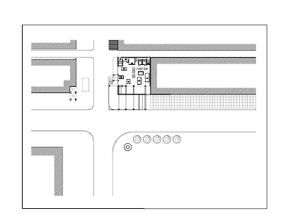
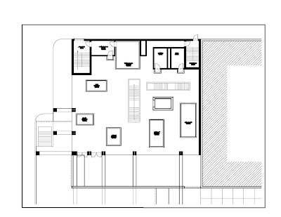
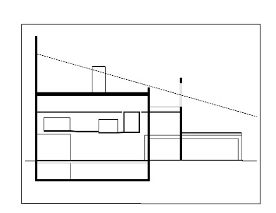
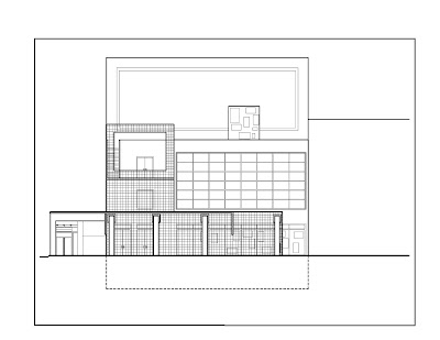
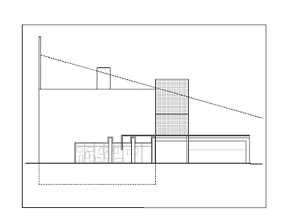
So I have been working on the packaging over the last few days. I have also been working on the 3d physical model and a 3d virtual model. I understand every one's comments regarding the technical drawings not clearly representing my ideas. (I will be posting the updated physical drawings later today) So I am building a 3d virtual model and will be cutting perspectives from that in order to give everyone a sense of my ideas as if they were in the space. I think this is the best way to do it. I was going to attempt to detail the boxes in model form but that would have required me to enlarge the model and with my idea traveling down the sidewalk this would have resulted in a 3'-0"+ long model! So the perspectives alone will work to portray my ideas.
The packing is concerning me. I have come up with some ideas by incorporating my framed box idea. My concern is that today you many many packages on the box that already represent my frame box. Therefore I have developed a layout of "interior" frames that are then held within a framed "building". From there I will be developing an envelope (the actual "product box"). What is going to make this packing unique is the play in density (transparency, translucency and opaque panels). Each of the frames shown below will include this idea into them as they are further developed.

Interior Frames - the different parts of the model will be inside these frames (acting as the apple product). The small boxes will each contain the street walls. The medium box will contain the apple store and the large box will contain the rest of the buildings.

This is the outside frame which will contain all of the "interior frames" this acts as the actual building does in my design.

This just shows the interior frames inside the building frame.
The envelope of this box and the density levels are still to come.


